

Listen to the post below.
(On iOS devices, audio recordings will open in a separate window. If you’d like to listen and follow along, reopen this page in addition to the audio file or follow along on a desktop or laptop computer.)
NOTE TO SELF:
Do red. But not JUST red.


Red is such an incredible color. In all instances, it stands out and speaks loudly. It can evoke so many different feelings and emotions just by its tone and depth. The brighter, more staccato hues are cheery and festive, while the deeper, more velvety reds lend themselves to drama and moodiness…dare-I-say, romance even. Red has many languages and can also be very nuanced, making it a great jumping off point for an exploration in color value.
When I first started toying around with techniques and dye options I really thought a lot about the sort of red I wanted to end with. I found myself categorizing the reds in my mind, trying to pick and choose that one red that speaks to me. This is always tricky because as much as I love colors, it’s not any one color that inspires me—it’s those marbled knots of several shades and tints of a color (even some familiar, corresponding colors thrown in for depth and interest) that capture my imagination. I suppose it’s the dimension that I love. So the photo that I used for inspiration is with this in mind. What you see in the photo is varied, with stark separation of color (the gray is gray, the orange is orange, the red is red…etc.), but I wanted to use it as a way to explore what all of these colors would do in a more blended application. I felt like the colors in this photo would come together on the yarn in a way that would produce a dimensional and character-rich ‘red’, alive with varied tone and vibrance.
And in order to control the brightness, I’d start with some of that gray.


NOTE TO SELF:
Play with value and toy with orange.
I also knew that I wanted this to be rich and sultry in its redness; not garish or sharp. It’s funny, this reminds me of a line from the movie The Holiday where Cameron Diaz’s character is trying to explain the sort of red she prefers for a movie trailer she’s producing. She says, “…but try it in a red. A happy red, not like a Scorsese red.” For context, Martin Scorsese is known for using red in his films. It’s sort of like a candy apple red. A bright, garish red. I can’t be sure exactly why it’s used in so many of his films or what sorts of emotions he’s endeavoring to evoke, but I can say with some certainty that it’s this candy-apple, cherry jelly bean red that I was hoping to avoid…at least in part. So sorry Scorsese…it’s just not for us this time.


However, despite wanting to avoid that sticky-sweet candy apple red on it’s own, I did want to allow some brightness to shine through the velvety richness that’s so beautifully built by layers of gray.
Enter orange.
Now, my initial thought was, oddly enough, to go with a more “Scorsese red” in the seams between the ribbons of grayish-red and paler shades (this toning of the red by the gray is where the values change), but I wanted to warm things up more…and not just a subtle warmth…like a shot of heat every so often. So orange was the best candidate for the job. After all, it’s right there in the inspiration photo.
Orange provides the quick heat while blending beautifully with the other more charred reds.
It’s there, but it’s not upstaging anything.


NOTE TO SELF:
Focus on emphasizing the fluctuating values of red. Make allowances for shades and tints to work hand-in-hand.
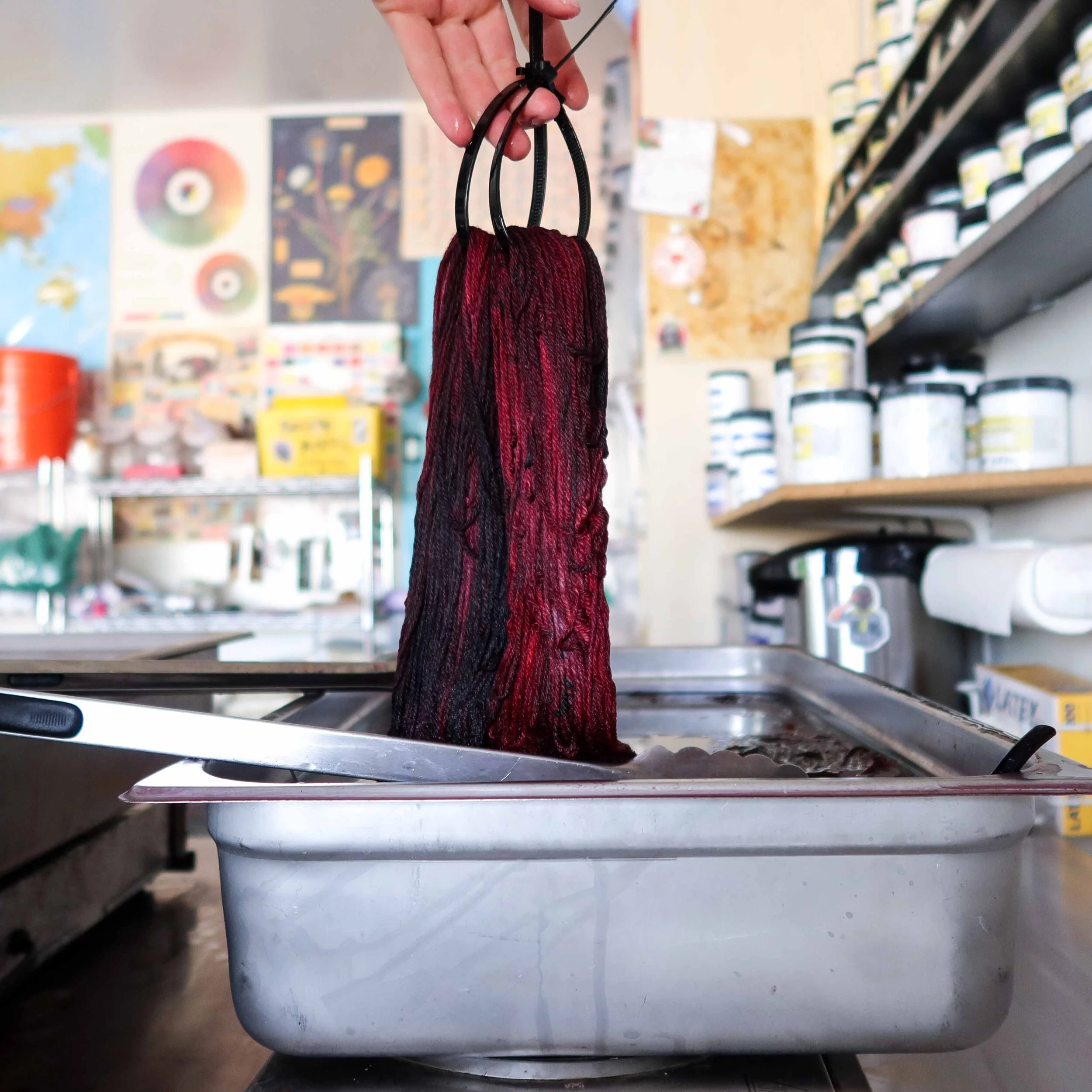
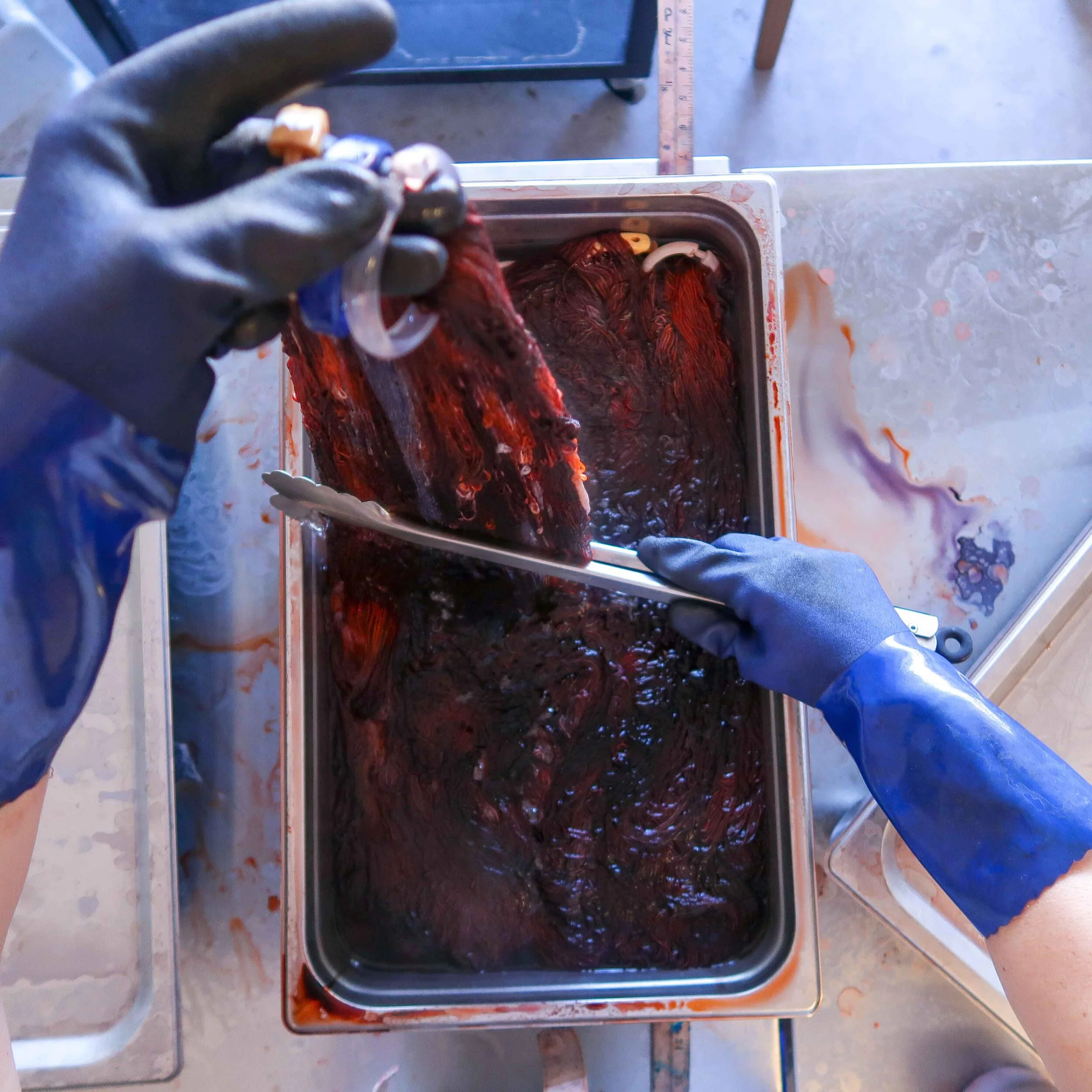
When you add white to a color, you adjust it’s tint…or you create a tint of what I like to call the “mother color”. When you add black, you build a shade. There is no such things as white dye. In textile dyeing (as in basic laundering), this is referred to as bleaching—and when it comes to dyeing yarn, we don’t want any part of that. We simply have to know when to pump the breaks on the color and leave naked space to keep things bright. However, we do have black and gray dye (as well as myriad colors that can serve as toners)…so building shades and depth is relatively easy when you have a steady hand and a firm understanding of how to tone colors down without going too far. In practice, it’s often best to develop a shade from the toner, up. In other words, start with the tone you’re going for and work up from that, adding the color as you go. I built this color in this manner, focusing my attention early on on the gray base coat. I didn’t want something solid—I wanted undulating gray so that the layers of color added on top would rise and fall in value creating moody, smoky reds as well as popping bright reds. I also knew that some of the gray would invariably peek through it all, and I wanted that too.


NOTE TO SELF:
I just love a black speckle…so go with that
I add black speckles because I think they create visual interest and dimension. It’s less about the speckle and more about the effect. I couldn’t leave well enough alone in this case, and I’m glad that I didn’t. The black speckling seals it all together, mingling with each color and bringing something from each to all of the others. I’m telling you, a black speckle can tie a look together.

It is truly a pleasure creating these colorways and I am so honored that you’re along on the ride with me. I hope you enjoy your yarn as much as I enjoyed creating it and I hope you find bits and pieces of all of this in each stitch you create. Please feel free to join in the conversation by leaving a comment below.
Take care,
Tayler